This post contains affiliate links. If you click a link and make a purchase, I may earn a small commission at no extra cost to you. I only recommend products I genuinely believe in. Thank you for supporting Amoria Style!
Pink is not a color. That’s the thing most nail guides get wrong from the first sentence. Pink is a family — spanning from a whisper of blush that barely registers against fair skin to the kind of saturated magenta that makes people look at your hands when you’re mid-conversation. The person wearing ballet pink and the person wearing hot pink have made completely different decisions, communicated completely different things, and they’ve done it while technically reaching for the same color.
That specificity matters. It matters for skin tone, for outfit, for nail shape, for finish. This guide treats pink with the seriousness it deserves.
The Near-Neutrals: When Pink Almost Isn't Pink
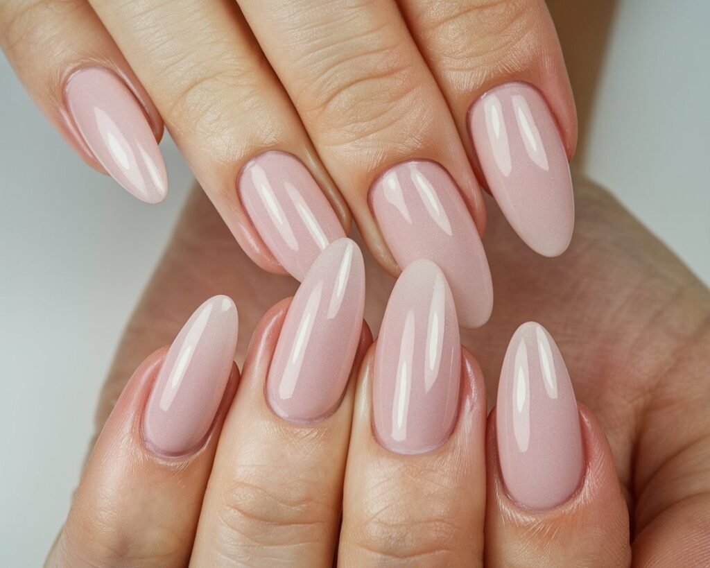
Blush, ballet pink, sheer pink — these are the pinks that function more like elevated nudes than anything you’d call statement-making. They sit in a category I find genuinely fascinating because they’re so dependent on context. On fair skin with cool undertones, a sheer ballet pink can look like your nail bed but better — cleaner, more refined, slightly lit from within. On deeper skin tones, that same shade disappears entirely or reads as slightly ashy, which is nobody’s goal.
The fix isn’t to abandon pale pinks on deeper skin — it’s to choose formulations with more opacity, or to shift slightly warmer. A barely-there pink with a peach or honey lean behaves completely differently than a cool, translucent blush.
The finish question matters enormously here. Near-neutral pinks work because of their translucency, which means cream finishes undercut the whole point. You want sheer and glossy. The light passing through the polish is what creates that luminous quality — block it with an opaque cream and you’ve just got a faint, flat color that reads as an unfinished manicure rather than an intentional one.
Nail shape is doing heavy lifting with barely-there pinks. Because the color itself has minimal presence, the shape has to carry the visual interest. Almond and oval are the right calls here — they add an elegant elongation that gives the pale shade something to work with. A short, square nail in ballet pink looks accidentally neutral. The same shade on an oval nail looks deliberate.
Two 2026 shades worth knowing in this family: the glazed donut pink, which Hailey Bieber made inescapable and which you can approximate with a sheer pink base coat finished with a chrome powder applied to the tacky layer before your topcoat seals it in. The chrome powder is essential — it’s what gives that glassy, dimensional quality rather than a flat shine. This technique only works on gel or shellac, not regular polish, because you need that slightly sticky uncured layer for the powder to adhere. The other shade is milky pink — think of your nail as a semi-opaque white with just enough pink to warm it. It reads like skin but elevated, like light from underneath the nail bed. Several coats to build opacity are usually required, and it rewards the patience.
The Classic Pinks: Immediately, Unambiguously Pink
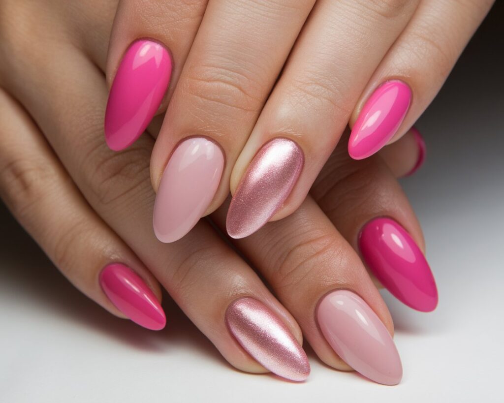
Bubblegum and rose pink occupy the territory where no one asks “is that pink?” — they just see pink. These are the pinks of childhood and pop stars and Valentines, and they’ve earned their place precisely because they’re uncomplicated.
But uncomplicated doesn’t mean identical. Rose pink has a cool, blue-leaning quality that works beautifully with cool undertones — the pink and the skin are pulling in the same direction, harmonizing rather than conflicting. Bubblegum tends toward neutral or very slightly warm, making it the more universally wearable of the two. Push into orange-leaning warm pinks in this family — coral-pink, salmon-pink — and you’ve moved into flattering territory for warm undertones specifically.
Finish options genuinely change the personality of a classic pink. Cream gives a polished, almost retro quality — there’s something 1950s about a perfect cream bubblegum pink on a shaped nail that I mean as a compliment. Satin softens the whole effect into something more contemporary and understated. Glossy adds energy and youthfulness, the way a lip gloss read differently than a matte lipstick even in the same shade.
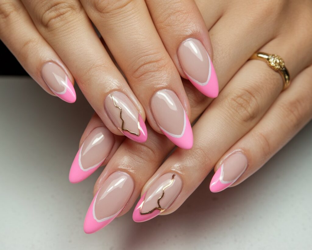
The French tip has evolved significantly in 2026. The classic bright white tip on natural is still around, but the pink French — where a deeper or brighter pink becomes the tip over a sheer or neutral base — has become genuinely mainstream. It’s worth understanding: a bubblegum tip over a milky pink base gives you something that reads as modern rather than nostalgic, feminine without being retro. The proportions matter — the tip should be thinner than a traditional French, closer to 2-3mm than the chunkier classic version.
Nail art over classic pink bases works best when it doesn’t compete. A single white flower painted at the cuticle base. A thin gold line near the tip. One rhinestone placed at the center base. The pink does the work; the detail is punctuation.
The Statement Pinks: They Don't Ask for Attention
Hot pink, fuchsia, magenta — these take attention. They don’t request it. There’s no version of this color family that reads as background.
Understanding why fuchsia is so broadly flattering is genuinely useful color theory. Fuchsia sits at the intersection of pink (warm) and purple (cool), which means it contains both warm and cool undertones simultaneously. Most skin tones have some combination of warm and cool elements — fuchsia meets them in the middle. It’s one of the few shades you can recommend with minimal caveats across fair, medium, and deep complexions, across cool, neutral, and warm undertones. Hot pink sits more purely warm and benefits warm to neutral undertones; deep wine-pinks pull cool and work with cool undertones specifically. But fuchsia genuinely earns its universal reputation.
Strong saturated pinks demand neutral outfits. This isn’t a style rule you follow because someone told you to — it’s physics of attention. When a saturated nail meets a saturated outfit, both are fighting for the same visual bandwidth. Give the nail space: white linen shirt, black dress, camel blazer. The nail becomes the accessory, and a saturated pink is a very good accessory.
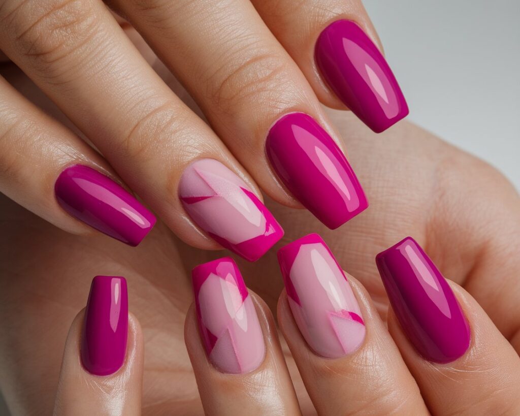
Nail length and shape justify the color. Short, round nails in hot pink can read as accidental — you got nail polish on your fingers. Square and coffin shapes on longer nails match the boldness of saturated pink: the architecture of the shape and the intensity of the color are in proportion.
The most interesting direction with hot pink or fuchsia right now isn’t maximalist — it’s negative space. Leaving the lunula (the half-moon at the base of the nail) bare against a fully saturated pink tip creates a graphic quality that’s more editorial than sweet. A geometric cutout in the center of a saturated nail, showing bare nail through a diamond or arch shape, is the kind of thing that reads as intentional rather than just colorful. The pink becomes a frame, not a flood.
The Warm and Dusty Pinks: Where Pink Meets Everything Else
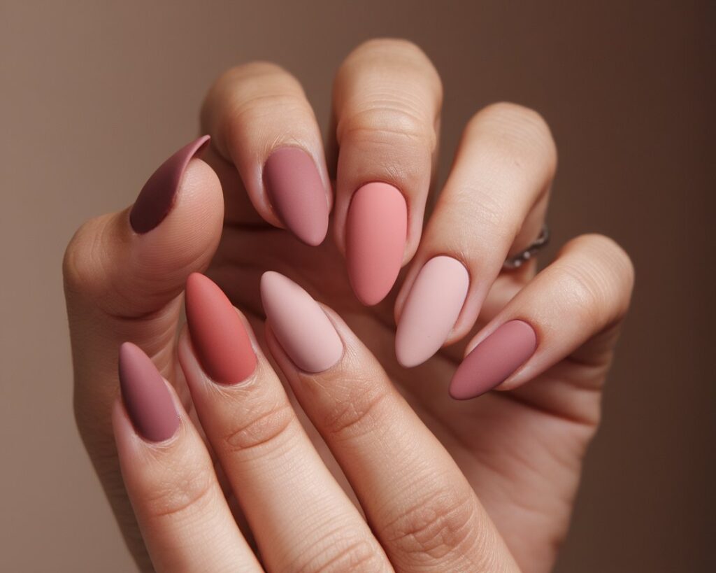
Terracotta pink, dusty rose, mauve — these are the most sophisticated of the pink families and also the most misunderstood. They sit at various intersections: dusty rose is pink that’s been grayed and gentled; mauve is pink sliding toward purple-grey; terracotta pink is the result of pink meeting warm brown and coming out beautiful rather than muddy.
These are the pinks of 2026’s dominant wardrobe direction — earthy, warm, grounded. They sit next to camel, rust, olive, warm white. They don’t compete with neutral outfits; they complete them.
Medium to deep skin tones particularly benefit from warm and dusty pinks because the warmth in the shade connects with the warmth in the skin and creates contrast and harmony simultaneously. On fair skin, dusty rose can look washed — you need to balance more warmth or more saturation to avoid the nail disappearing. But on brown skin, warm mauve or terracotta pink creates one of the most beautiful nail-to-skin combinations available.
The season question: dusty rose is actually the most year-round pink. It doesn’t read hot-weather or cold-weather — it reads elevated. Summer, autumn, winter — it adapts. Terracotta pink peaks in autumn naturally. Mauve is a winter shade that bleeds into spring. For a single shade in this family to maintain through four seasons, dusty rose is your answer.
Finish: satin or velvet matte, not high gloss. Gloss on a dusty or earthy tone adds a harshness that works against the sophisticated, nuanced quality these shades have naturally. A velvet matte finish on mauve looks expensive in a way that the same shade in gloss doesn’t. This is one of those small technical choices with outsized effect.
The Special Effects: Chrome, Holographic, Jelly
The last pink family isn’t defined primarily by hue — it’s defined by what the finish does to light.
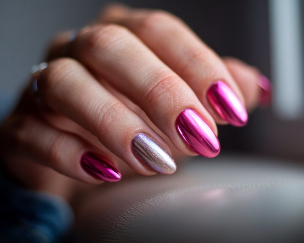
Chrome pink applies via a different technique than standard polish: gel base, cure, apply chrome powder to the tacky layer before your topcoat, seal. The tacky uncured gel is what grabs the powder and creates that mirror-like surface. This is fundamentally incompatible with regular nail polish — the chemistry doesn’t work, the powder won’t adhere properly, and you’ll end up with something that looks more brushed than mirrored. The result, done correctly, is a pink that looks like a liquid metal surface on the nail. In direct light it’s striking; in diffuse light it has a dimensional depth that flat colors can’t replicate.
Holographic pink contains multitudes. In strong sunlight it throws rainbow light from every angle and becomes its own light show. Under indoor fluorescent or LED lighting, it reads more like a standard shimmer — still beautiful, but quieter. Buying a holographic pink knowing it will behave this way lets you enjoy both personalities rather than feeling deceived when it shows up differently in different contexts.
Jelly pink is the semi-transparent, candy-like finish that reads like a gummy bear became a nail. The key word is patience — one coat of a jelly formula gives you almost nothing. Three to five coats build the depth that makes it work. The translucency means you’re seeing through layers of pink, which creates the same lit-from-within quality as the barely-there pinks but with more saturation and a glossy, glassy surface. It’s a commitment in application time that rewards the investment.
Pink by Skin Tone: The Actual Guide
Generic advice — “all pinks suit everyone with the right undertone” — is technically not wrong but practically useless. Here’s what actually works:
Fair skin, cool undertones: Blush, ballet pink, fuchsia, and lavender-pink are your family. The near-neutrals elongate; fuchsia creates a beautiful cool-on-cool harmony. Avoid warm pinks — orange-leaning coral or terracotta on cool fair skin creates an unintentional clashing effect.
Fair skin, warm undertones: Peach-pink, coral-pink, and warm rose are your territory. The warmth in the shade and the warmth in the skin work together. Pure cool pinks — anything with heavy blue — can make your skin look slightly sallow.
Medium skin, neutral undertones: This is the most flexible category. Bubblegum, rose, dusty rose all perform well. Most of the classic pink family is genuinely accessible here.
Medium skin, warm undertones: Terracotta pink, salmon, and warm magenta. The earthy-pink family was practically invented for this combination — the depth and warmth are in harmony.
Deep skin, cool undertones: Fuchsia and hot pink create one of the most striking combinations available — the saturation reads against deeper skin in a way it simply can’t on fair skin, with more contrast and visual impact. Wine-pink and berry also perform beautifully.
Deep skin, warm undertones: Coral-pink, orange-pink, and warm mauve. The warm, slightly orange-leaning pinks that would overpower fair skin find their perfect partner in warm deep complexions.
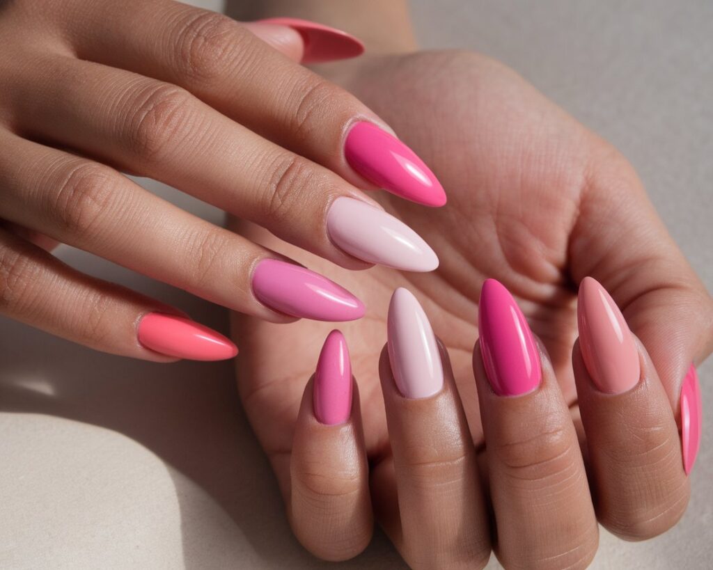
Pink rewards specificity. Not “pink nails” but which pink, in which finish, on which shape, against which skin tone. The fourteen ideas in this guide span the full family — from barely-there blush that functions as a better nude to saturated magenta that becomes the focal point of an entire outfit. The decisions are yours, but they work better when they’re actual decisions rather than defaults.
