

This post contains affiliate links. If you click a link and make a purchase, I may earn a small commission at no extra cost to you. I only recommend products I genuinely believe in. Thank you for supporting Amoria Style!
An outfit that looks completely fine in the mirror can look genuinely off on a video call — washed out, distracting, or strangely shapeless in a way that has nothing to do with how it actually fits or suits you. This isn’t really about fashion in the traditional sense. It’s about how cameras, compression, and small screens interpret color, pattern, and contrast differently than your eyes do in person, and once you understand the specific differences, dressing for video calls becomes a solvable problem rather than a guessing game.
Why Cameras See Differently Than Eyes Do
Webcams and video compression algorithms don’t render color and detail the way human vision does. Most webcams have relatively limited dynamic range compared to your eyes, which means they struggle more with high contrast and fine detail, and they process color through a more limited and sometimes inaccurate color space. Video compression — the process that shrinks video data to stream smoothly — also specifically degrades fine detail and high-frequency patterns, which is why certain prints behave very differently on screen than they do in person.
This combination explains most of what makes an outfit “good” or “bad” on camera, independent of the outfit’s actual quality or how it fits.

Patterns That Cause Problems
Fine stripes, small checks, and tight herringbone patterns create a visual effect called moiré — a shimmering, strobing distortion that happens when a fine repeating pattern interacts with the camera sensor’s own grid of pixels. This isn’t about the pattern looking bad aesthetically; it’s a genuine technical artifact that makes the fabric appear to vibrate or shimmer in a distracting way on screen, even though the same pattern looks completely normal in person. Fine pinstripes and small gingham checks are the most common offenders.
What works instead: Solid colors, or patterns with a larger, looser repeat — a wider stripe, a larger-scale print — render cleanly because the pattern’s repeat is large enough relative to the camera’s resolution that it doesn’t create the same interference effect.
Color Choices That Actually Matter
Pure white often appears as a blown-out, overexposed mass on camera, because most webcams’ automatic exposure adjusts to the brightest element in frame — meaning a stark white top can cause the camera to underexpose everything else, including your face, in order to compensate for the white area’s brightness. The result is a washed-out, poorly lit appearance that has nothing to do with your actual lighting setup.
What works instead: An off-white, cream, or very light pastel achieves a similar visual effect to white without triggering the same exposure compensation problem, because it doesn’t read as pure white to the camera’s automatic exposure system.
Pure black can have the opposite problem in certain lighting setups — webcams sometimes struggle to capture detail in very dark areas, which can make black clothing appear as an undefined dark mass that merges into shadow, particularly in dimmer rooms or with backlighting.
What works instead: A dark navy, charcoal, or deep jewel tone reads as similarly sophisticated to black but retains more visible texture and definition on camera, avoiding the “black hole” effect that pure black sometimes creates.
Colors close to your skin tone can create an unflattering blending effect where clothing and skin merge into a single undefined mass, particularly noticeable around the neckline. This effect is more pronounced on camera than in person because the reduced dynamic range compresses subtle tonal differences that your eye would normally distinguish easily in person.
What works instead: Choosing a top color with clear contrast against your specific skin tone — not necessarily a dramatic contrast, but enough separation that the camera’s more limited tonal range can still distinguish where your clothing ends and your skin begins.
Neckline and Framing Considerations
Video calls crop the body at a fixed point, usually somewhere around the upper chest, which means neckline choice has more visual weight on a call than it typically does in a full outfit context, where the neckline is just one element among many.
Higher necklines — crew necks, mock necks, collared shirts — tend to read as more polished and put-together within the cropped frame of a video call, because they fill the visible space more deliberately rather than leaving an undefined gap of skin and fabric that the camera frame cuts through arbitrarily.
Very low or wide necklines can look different on a call than intended, because the camera’s framing point is unpredictable — depending on your exact distance from the camera and your camera’s specific field of view, a neckline that looks intentionally styled in a mirror might be cropped at an awkward point on a call, creating a different visual effect than planned.
Statement earrings and necklaces read disproportionately well on video calls compared to how they read in a full-length mirror, precisely because the call crops to focus attention on the face and upper chest area where these accessories sit. This is one of the few areas where investing slightly more visual interest pays off specifically for video call contexts, even if the same piece might feel like “too much” in a full-body outfit photo.
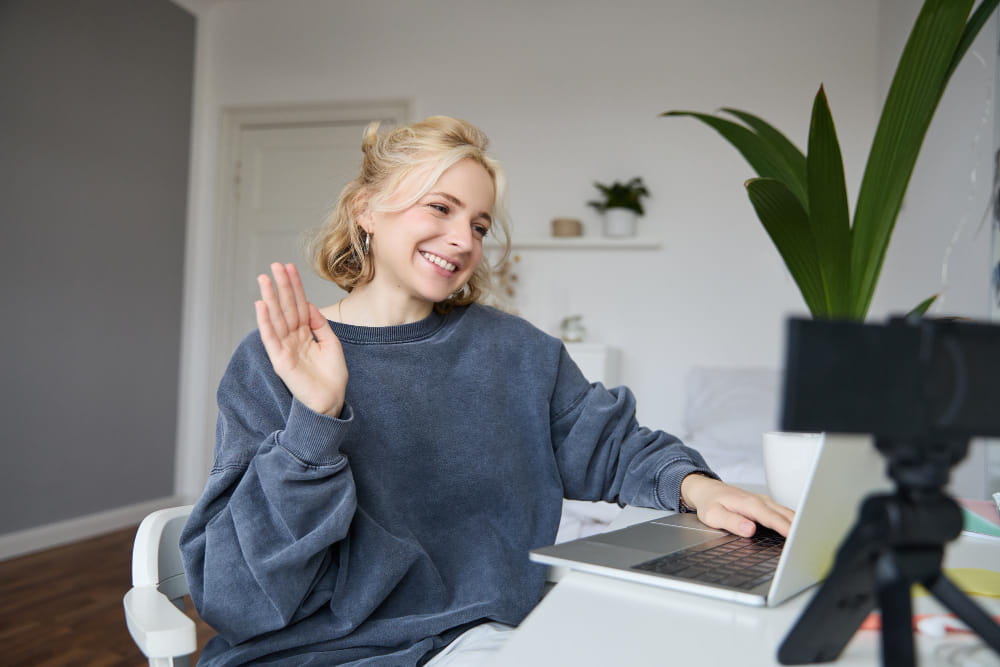
Lighting Interacts With All of This
None of the above operates independently of lighting, and it’s worth understanding that a “bad on camera” color choice in poor lighting can look completely fine in good lighting, and vice versa.
Front-facing, diffused light — a window you’re facing directly, or a ring light — minimizes the harsh shadows and blown-out highlights that make problematic color and pattern choices more noticeable. Backlighting — a window or light source behind you — exacerbates almost every issue described above, because it forces the camera’s exposure system to work harder and produces more contrast and shadow that interacts poorly with both very light and very dark clothing.
If you’re regularly on video calls, addressing the lighting in your specific setup often solves more visual problems than any clothing choice alone — but understanding the clothing factors above gives you a second lever to pull when you can’t fully control the lighting (different rooms, different times of day, calls from unfamiliar locations).
A Simple Practical Approach
For anyone who doesn’t want to think about this extensively before every call: a small collection of solid-colored tops in colors with clear contrast against your skin tone — avoiding both pure white and pure black, avoiding fine patterns — covers the vast majority of situations without case-by-case decisions. Test a few once, on your actual camera, in your usual lighting, and just note which ones look right. That beats any general rule.
