This post contains affiliate links. If you click a link and make a purchase, I may earn a small commission at no extra cost to you. I only recommend products I genuinely believe in. Thank you for supporting Amoria Style!
There’s a specific frustration that happens when you’re standing in front of a wardrobe full of clothes you individually like and can’t make a single outfit that looks the way you want it to. Every piece is fine. Together, something is off. The problem is almost always colour — not the colours themselves, but the relationship between them.
Colour theory sounds like something that belongs in an art class. In practice, it’s just a set of principles that explain why certain combinations feel harmonious and others feel like they’re fighting each other. Once you understand three of those principles, the “why doesn’t this work” problem largely disappears.
Why Your Eye Responds to Colour Combinations the Way It Does
Your brain processes colour relationships, not just individual colours. When you see two colours together, your visual system automatically evaluates their relationship — the contrast between them, whether they share underlying tones, whether they compete or complement. This happens before you consciously think about whether you like the outfit.
The reason some combinations feel immediately right is that they’re working with how your eye naturally processes colour. The reason others feel “off” even when you can’t articulate why is that they’re working against it.
Understanding three relationships — contrast, undertone, and saturation — explains the vast majority of outfit colour decisions.
Contrast: The Most Important Variable
Contrast is the difference in lightness and darkness between colours. High contrast means one element is significantly lighter than another — white and black, cream and navy, pale pink and deep burgundy. Low contrast means the elements are similar in lightness — camel and tan, dusty rose and blush, navy and forest green.
Neither high nor low contrast is inherently better. They create different effects and suit different contexts.
High contrast outfits read as sharp, defined, and deliberate. They photograph well because the camera can clearly separate the elements. They draw attention to the outfit itself. The risk is that high contrast requires precise execution — a slightly wrong shade in a high-contrast combination is immediately obvious because the contrast throws everything into relief.
Low contrast outfits — often called tonal dressing — read as sophisticated, considered, and intentional when done correctly. They’re harder to photograph well but easier to wear in a way that looks effortlessly polished in person. The risk is that without enough variation in texture or silhouette, low contrast can read as unintentional rather than deliberate.
The most common mistake with contrast isn’t choosing the wrong level — it’s mixing contrast levels inconsistently. A high-contrast outfit with one medium-contrast element added (a medium grey added to black and white, for example) creates visual confusion because the eye doesn’t know where to focus. Commit to a contrast level and maintain it across the outfit.
Undertone: Why Some Colours Fight Each Other
Every colour has an undertone — a subtle warmth or coolness beneath its surface. Camel is warm. Dusty blue is cool. Cream is warm. Stark white is cool. Burgundy is warm. Cobalt is cool. Olive is warm. Slate grey is cool.
Combinations that feel inexplicably “off” are very often an undertone conflict. Warm camel with cool grey. Warm cream with cool white. Warm terracotta with cool cobalt. Each piece might be individually appealing, but because their undertones pull in opposite directions, they create visual tension rather than harmony.
Combinations that feel immediately right are often undertone-matched: warm camel with warm rust with warm cream. Cool slate with cool dusty rose with cool stone. The colours don’t have to be similar — they just need to share the same underlying temperature.
How to identify undertones practically:
Warm colours have yellow, orange, or red beneath their surface. Hold them next to a piece of paper and look at whether they push toward yellow or toward blue.
Cool colours have blue, green, or purple beneath their surface. They read as crisp or icy rather than golden or earthy.
Some colours are neutral — true navy, certain greens, some greys — and work with both warm and cool combinations. These are the most versatile pieces in any wardrobe precisely because they don’t impose an undertone direction.
Saturation: The Variable Nobody Talks About
Saturation is how intense or muted a colour is. A bright, vivid red is highly saturated. A dusty rose is the same hue — red — at low saturation. Cobalt blue is highly saturated. Slate blue is the same hue at low saturation.
Saturation matching is one of the most powerful tools for creating cohesive outfits, and almost no one talks about it explicitly.
Outfits that mix saturation levels inconsistently — a dusty muted blush with a vivid cobalt, for example — feel imbalanced. The vivid colour dominates completely, making the muted piece look washed out rather than soft. The combination isn’t wrong in terms of hue or undertone, but the saturation mismatch creates a visual hierarchy that wasn’t intended.
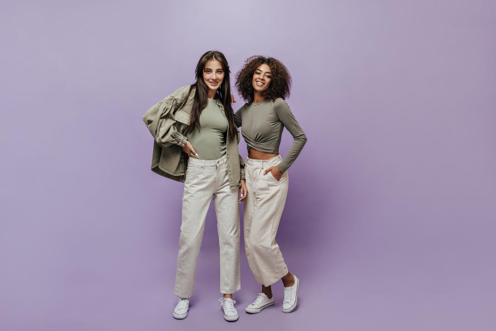
Outfits where all pieces share a similar saturation level feel cohesive even when the colours themselves are quite different. A wardrobe built around muted, dusty tones — sage, blush, stone, dusty blue, terracotta at low saturation — will always combine easily because everything shares the same colour quality. The same is true of vivid, high-saturation combinations — cobalt, vermillion, emerald — which work together for the same reason.
The practical implication: when building a wardrobe for maximum combinability, choose a saturation range and stay within it. Either muted/tonal or vivid/bold — mixing freely between the two is where combination problems most consistently arise.
The Three Combinations That Always Work
With contrast, undertone, and saturation as the framework, three types of colour combinations consistently work across contexts:
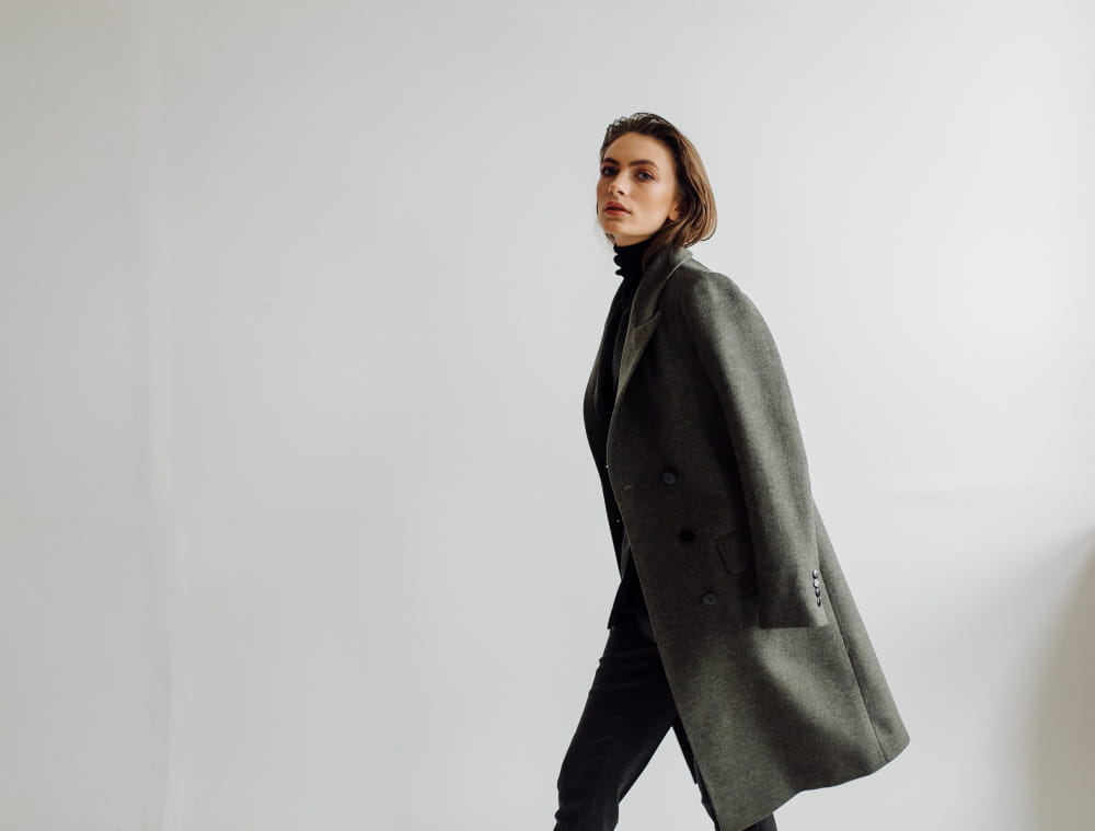
Tonal (low contrast, matched undertone, matched saturation) Different shades of the same colour family, or colours so close in hue that the outfit reads as one considered palette. Camel, tan, and cream. Dusty rose, blush, and stone. Navy, slate, and pale blue. The outfit looks cohesive because every variable is aligned. The risk — looking washed out — is solved by introducing texture variation rather than colour variation.
Neutral plus one A base of two or three neutrals (black, white, grey, camel, stone, navy) with a single saturated accent. Black trousers, white shirt, cobalt bag. Camel coat, cream knit, burgundy boots. The neutrals provide stability; the single accent provides interest. This combination works because it gives the eye a clear structure — the neutral base and the accent — rather than multiple competing elements.
Complementary with saturation matching Colours from opposite sides of the colour wheel — orange and blue, red and green, yellow and purple — create natural visual tension that reads as dynamic rather than conflicting when the saturation levels match. Dusty terracotta and dusty sage. Vivid cobalt and vivid amber. The key is matching — dusty terracotta with vivid cobalt fails for the same saturation mismatch reason described above.
The Combination That Consistently Fails
More than one “statement” colour in the same outfit at the same saturation level. Two vivid, high-saturation colours worn together require a very specific colour relationship (typically complementary or analogous with precise saturation matching) to avoid looking chaotic. Most people who try this and dislike the result haven’t done anything wrong with the individual pieces — the combination just needs more precision than most casual dressing allows for.
The solution isn’t to avoid colour — it’s to let one colour lead and support it with neutrals or lower-saturation versions of secondary colours. One piece does the work; everything else supports it.
How to Use This Practically
Before getting dressed, ask three questions in this order:
What contrast level am I going for today? High contrast (sharp, defined) or low contrast (tonal, soft)? Decide first and choose pieces that all sit at the same level.
Do these pieces share an undertone? Hold them next to each other and look for whether they both pull warm or both pull cool. If one fights the other, something needs to change.
Are the saturations compatible? If one piece is vivid and the others are muted, either add more vivid pieces or switch the vivid piece for a muted version of the same colour.
Three questions. Two minutes. The answer to most outfit problems that feel impossible to articulate is somewhere in that sequence — try it tomorrow morning before you reach for anything.
